

Category: Communication
(17 von 100)
Why: We want to give you an overview of data visualization because a little attention to types of charts can fasten a chart creation significantly.
Proof: From my experience, one can tell more specifically with charts more than images and icons. Check this funny post from visme: 10 Funny Charts That Perfectly Explain Everyday Life
In a flash, here is how you do it!
Table of Contents
In Short
So we all understand the effectiveness of charts. However, we feel that it is daunting to create one. So, yes, this is a balance between the workload of the creator and the audience.
Chart creation requires pinpointing ideas and data. And these are not easy to come by. So we need to put in work intentionally. I hope the following guideline can help us all create a chart quickly.
1. Know your Intention
This has become a repetition of the last few blogs, as to create any visual aid, one needs to continuously ask oneself, what is the message/purpose of this visual?
2. Know Chart Character
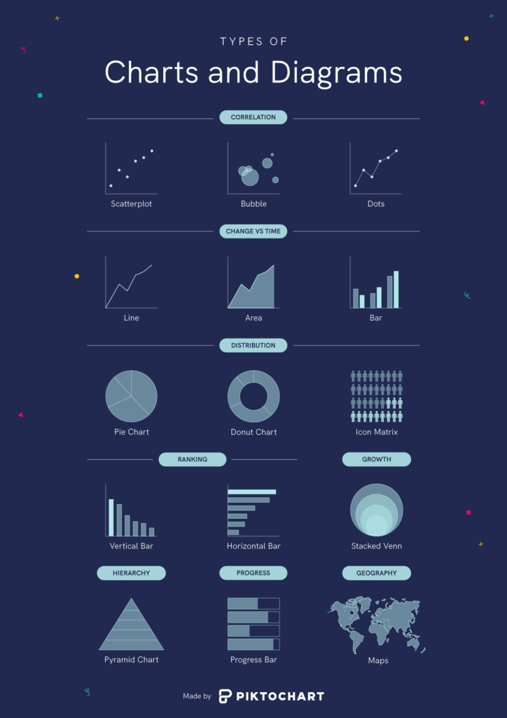
Below is the summary of charts and diagrams. First, use it as a quick guideline to determine the type of chart. Then, here is a step where we usually stuck and fail to pick appropriately.
3. Highlight the Point
Lastly, underline the specific part of the chart to help the audience pick up the message. Unfortunately, this is also a step where most people are left out.
Part of it is because we are now using charts to sell products and services. We should aim to state our claim in everything we do.
Conclusion
A chart is a powerful tool to inform audiences about the correlation, changes, distribution, ranking, growth, hierarchy, progress, etc.
Pick the chart that fits your intention of the message. And do not forget to highlight your message inside the chart too!