Category: Design
(15 von 100)
Why: We want to convince you about how easy it is to choose a color for your website so that we get more traction.
Did you know that?
- Warm colors like Red and Yellow stimulate hunger.
- White is the safest car color, and probably for other products too.
- Yellow makes us dizzy.
In a flash, here is how you choose a color scheme!
Table of Contents
In Short
We need to choose the right color for our website because color affects human behavior: color psychology!
So in this post, we will learn how to use colors to represent our message in advantageous ways. Help our customers focus and highlight what we need them to.
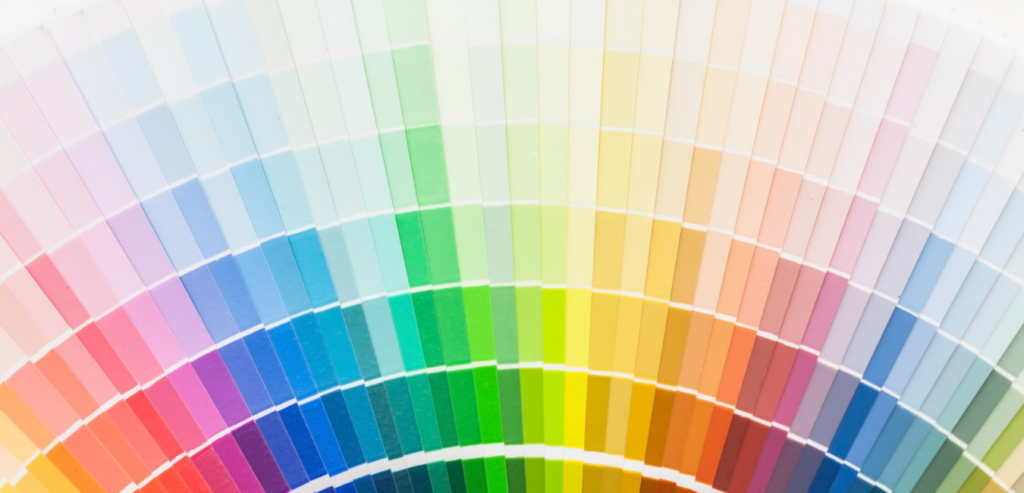
Below are ways to manipulate the pure/hue color palette and create a color scheme.
1. Add Grey Scale Colors
Personalize with monotone? Here is how to stay with the same color.
- Add white to get Tint
- Add grey to get Tone
- Add black to get Shade

2. Create a Color Scheme
Want to make an element stands out? Contrast them from the environment.
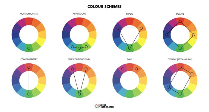
- Complementary colors = the direct opposite of one color.
- Split-complementary colors = two direct opposite of one color.
- Triadic and Tetradic = a triangle or rectangle within the color wheel.
- Analogous colors = two colors sitting next to the primary color.

Conclusion
So you now know about color psychology, that colors affect our behavior. And how to create a color scheme for your own e-commerce website.
If you need help with mixing some shades, here are some awesome tools: Coolors.co or Khroma.co for personalized palettes
Reading material: Visit Storytelling course from Piktochart Academy.

