Category: Design
(16 von 100)
Why: We want to show you how to use icons in your infographic so that our audiences don’t get lost during the reading.

90% of information transmitted to the brain is visual.
In a flash, here is how you do it!
Table of Contents
In Short
At first, our brain looks for visuals, then for texts. It defaults on what requires the least energy to digest.
Icons give information a pattern, therefore, it is preferred to letters.
1. Choose with Customer-intent

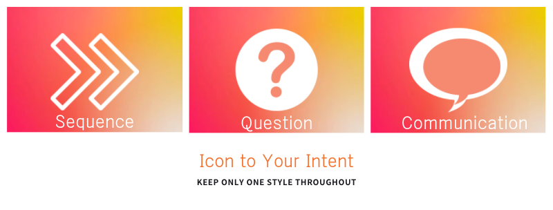
- Objective: tell sequence = arrow, survey = questionmark, communication = talk bubble, etc.
- Ask yourself about the keyword, what comes to mind?
- Is the selected icon universally understood, or not? At least for our target audiences?
2. Stay Consistent
Throughout your article, you should keep only one style of icons.
- So look out for mono-tone or duo-tone.
- Flat or embossed.
- Colored or outlined. Etc.
Conclusion
Use icons as a sign to tell audiences’ brains where and what to look for. You just have to be careful whether that selected icon actually leads to the right meaning.
Lastly, Keep it simple by stick with only one style.
Reading material: Visit Storytelling course from Piktochart Academy.

