Category: Design
(14 von 100)
Why: We want to convince e-commerce site owners that they can easily use the power of fonts to make our website and creatives look interesting and beautiful.
Did you know there are more than 200,000 fonts that exist in the world? So how on earth would we non-designer know which is good? Today, we will give you some tips about that.
In a flash, here is how you do it!
Table of Contents
In Short
The font shows the personality of your writing. The various types of font are there to connect with readers’ psychology. It expresses a feeling of texts: formal, informal, fun, etc.
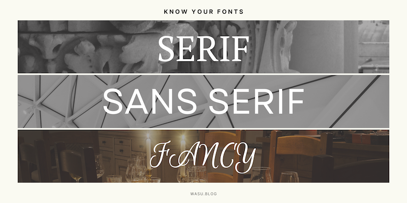
1. Main Types: Serif, Sans Serif, Fancy
- Serif fonts = letters with an extension at the end of the strokes.
- Sans-serif fonts = Sans means ‘without’ in French, so no extension of the strokes.
- Fancy fonts = decorative fonts.

2. Font and Feeling
- Serif fonts = Respectable, Reliable, Traditional
- Sans-serif fonts = Professional, Clean, Modern
- Fancy fonts = Playful
3. Fonts Pairing
- Serif fonts = Good for title and headline, and short body text
- Sans-serif fonts = Easiest to read, good for body text
- Fancy fonts = Good for title as it graps attention, but hard to read as a body text
The rule of thumb is to stick with no more than 2 fonts.
What if you need to distinguish information from the rest? Then here are some tips.
Use Bold, Italic, Underline to style them.
Or, vary the font sizes and capitalized LETTER.
Or vary color.
Conclusion
So we learned that fonts show the personality of the text. And each type of font connect to our reader’s psychology differently. Therefore, we should be careful with fonts pairing.
Follow the given guideline, and make our e-commerce site looks pretty now!
Do you need some help with font pairing inspiration? Check this website out: fontjoy.com
Reading material: Visit Storytelling course from Piktochart Academy.

